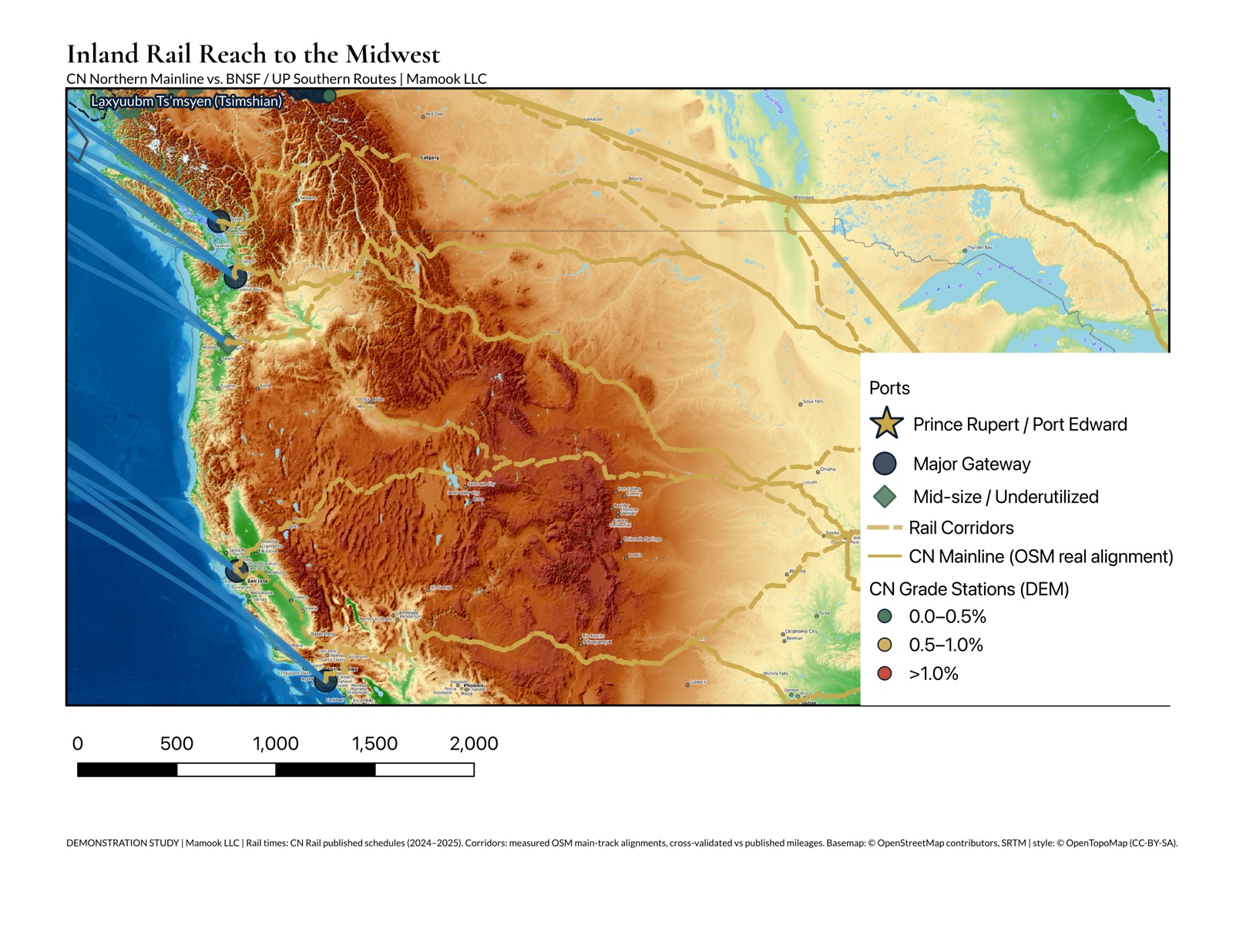
Map showing Prince Rupert port, CN rail corridor, and maritime shipping routes to Asia
Supply Chain Mapping

Port Edward & Prince Rupert: Transpacific Corridor Analysis

An end-to-end logistics analysis comparing West Coast gateways on transit time and landed cost for container traffic between Asia and inland North America — on Ts’msyen territory, along the CN northern mainline.

Type: Self-directed portfolio analysis Year: 2026 Services: GIS Analysis, Logistics Modeling, Interactive Visualization
Read the Full Analysis Explore the Interactive Map

Land Acknowledgment

This work traverses the traditional and ancestral territories of the Ts’msyen (Tsimshian), Nisga’a, Gitxsan, Wet’suwet’en, Carrier, and Nuxalk peoples. These nations govern their lands today. The port’s geographic advantage is a function of this territory; its logistics value cannot be separated from the lands and waters that make it possible.

Mamook does not conduct or represent Indigenous consultation — on this corridor that is government-to-government and nation-to-nation. Indigenous territory boundaries used in this project are credited to Native Land Digital.

The Challenge

Shippers moving containerized goods from Asia to inland North America face a recurring routing decision: which West Coast gateway? Routing through Prince Rupert on the CN northern mainline differs measurably from the competing gateways in sailing distance, terminal dwell, harbour depth, and corridor grade.

Gateway competitiveness is discussed constantly in industry press, rarely with sources attached. Mamook built this analysis independently, from published data, to test whether a transparent comparison of end-to-end logistics chains — Asian origin port to inland hub — was possible without a client commissioning it.

Approach

Data Acquisition

GeoJSON datasets built from public sources: Prince Rupert Port Authority disclosures, NGA Pub. 151 sea-lane distances, published carrier transit figures (CN, CPKC, BNSF), OpenStreetMap rail geometry, and Copernicus GLO-30 elevation. Geometry simplified for web delivery — see Data Accuracy Notes below.

Interactive Corridor Comparison

React + Leaflet app with layer controls and lane-level metrics. Users select a port-to-hub lane and see its transit decomposition — sailing, dwell, rail, and total — with dwell figures badged as sourced or illustrative. Responsive design works on desktop and mobile.

Technical Stack

  • Python (geopandas, shapely, geojson)
  • React 18 + TypeScript + Leaflet 1.9
  • Tailwind CSS 4 (responsive styling)
  • Vite 6 (build optimization)
  • WordPress custom template

Data Accuracy Notes

  • Rail Geometries: Measured shortest paths over OpenStreetMap main-track rail, Dijkstra-stitched from a tiled Overpass extract and cross-validated against published passenger-route mileages. These are network shortest paths, not carrier routing guarantees.
  • Maritime Routes: Tabulated distances are published practical sea lanes (NGA Pub. 151 and composites); the arcs drawn on the map are great circles for display only. Real vessel routing also responds to weather, currents, and traffic separation schemes.
  • Sailing Times: Computed at 18-knot mean service speed, reflecting current slow-steaming practice rather than the retired 22-knot assumption.
  • Dwell Times: Sourced where a published operator figure exists; 3 of the 7 ports compared carry illustrative dwell-time placeholders (Portland OR, Seattle / Tacoma (NWSA), Oakland CA) and 1, Port Edward (PR bulk), is a stated modelling assumption, rather than published operator figures; they are labelled as such wherever they appear.
  • Cost Model: Rate assumptions from published disclosures and industry benchmarks, published alongside the figures in the full analysis. Annual averages, not real-time data.

Results

Transit Time Advantage

Measured end to end — sailing, terminal dwell, and rail — Prince Rupert reaches Chicago in 17.15 days: 2.03 days ahead of Vancouver BC and 5.67 days ahead of Los Angeles / Long Beach.

Where the Advantage Does Not Hold

On modelled landed cost per TEU, Vancouver BC ranks ahead of Prince Rupert by $23.48. The advantage this analysis supports is time, not cost — and we publish the metric where the subject loses.

Honest Uncertainty

3 of the 7 ports compared carry illustrative dwell-time placeholders (Portland OR, Seattle / Tacoma (NWSA), Oakland CA) and 1, Port Edward (PR bulk), is a stated modelling assumption, rather than published operator figures; they are labelled as such wherever they appear. Every total that depends on them inherits that uncertainty.

Reproducible by Construction

Every figure published here is generated directly from the analysis pipeline. A continuous integration check fails the site build if the published numbers drift from the pipeline that produced them.

This is a self-directed portfolio analysis, not a commissioned engagement — Mamook built it to demonstrate the kind of transparent, source-cited logistics modeling available to organizations evaluating corridor decisions. The figures above are Mamook's own modelled estimates from the sources listed, not verified operational data from the Prince Rupert Port Authority or CN Railway, and Mamook claims no endorsement by either. It is a demonstration study, not commercial due diligence.

What's Included

  • Full published analysis — methodology, comparison tables, sensitivity, and sources
  • Interactive web application (React + Leaflet)
  • 7 GeoJSON data files (ports, rail, maritime, inland hubs, historical routes)
  • Measured rail corridor geometry over OpenStreetMap main track, cross-validated against published route mileages
  • Corridor elevation and grade profile from Copernicus GLO-30 (30 m)
  • Responsive design (desktop and mobile)

Ready to Map Your Logistics Network?

Mamook builds custom GIS analyses for supply chain optimization, site selection, and infrastructure planning — sourced data, stated assumptions, and maps that hold up to scrutiny.

Start Your Project